Components built for every state
Maridadi's components cover every state an operations user can hit, not just the default.
Buttons: 120 variants. Four styles (filled, outline, ghost and link) come in three sizes and five interaction states, in a primary teal and a destructive red. Labels follow a verb–noun pattern, like "Save agent" or "Upload file", with optional leading and trailing icons.
Dialogs: a basic modal in two header styles, with a swap slot for the body so one component can hold a form, a confirmation or a table.
Feedback cards: info, success, warning and error messages, each mapped to its semantic colour and icon, with one clear action.
Each component's documentation covers when to use it, when not to, accessibility notes, and its matching component in code.
Five people, one system
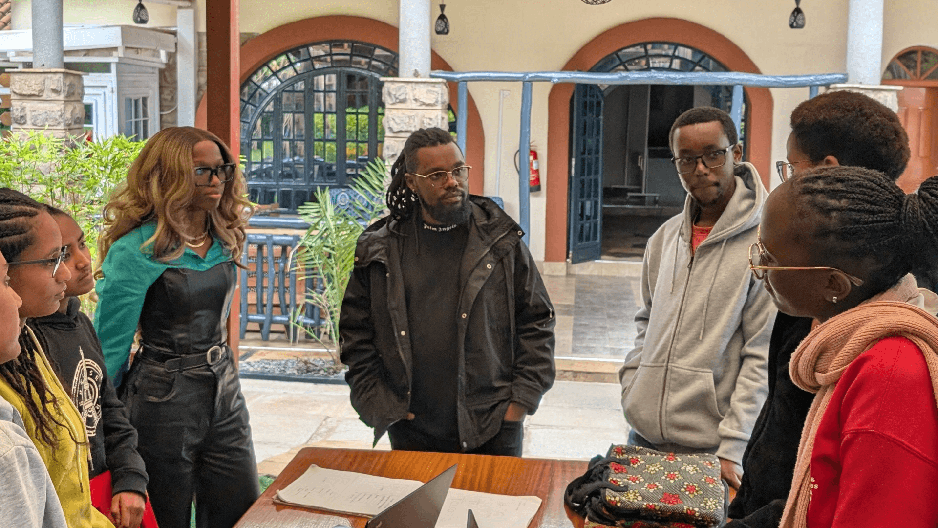
Maridadi was a team effort. I took point in a team of 5 designers, and my job was to keep five people's work feeling like one system.
Direction and standards: I set the principles, the naming conventions, and the quality bar every component had to meet.
Ownership: foundations and component areas were split across the team, with a named owner for each, so everyone knew who to ask.
Embedded designers: each designer worked inside the squads and built components through live features, so the system grew from real needs and became part of delivery rather than extra work.
Critique and review: regular reviews caught drift before it reached the library.
Governance: releases, not live edits
We ran the library like a product with releases, so changes never reached designers' files without warning. Each change followed the same path:
Branch: every change was made on a Figma branch, never directly on main.
Review: the branch was checked for visual consistency, interaction patterns, accessibility and technical feasibility before merging.
Release: changes were published on a predictable cadence, each with a changelog saying what changed, why, and whether designers needed to act.
Breaking changes: changed props, renamed variants and restructured layers were announced in advance, tested in live files and shipped with migration notes, so designers could update at a sensible point in their sprint.
Deprecation: components were never deleted outright. They were flagged, moved to a deprecated page and linked to their replacement. After a sunset window, and once library analytics showed which files still used them, we helped those designers migrate before removing them. Engineering followed the same timeline.
Adoption: making the system the easiest way to ship
A design system only works if people use it, so I built adoption into how work got done and measured it on both the design and engineering sides.
Built into the workflow. Maridadi was linked to our DesignOps practice. Design system fluency is part of onboarding in weeks two and three. Design QA reviews every feature before handoff, and each review is tied to a Jira ticket and a Figma file. Using the system became the normal route to shipping.
Parity with engineering. Component names, props and tokens match between Figma and code. Engineers joined component reviews, and nothing was published without a feasibility check.
Measured:
Design: Figma library analytics for inserts, detach rates and which files used the library. A spike in detaches usually meant a missing variant, so it went on the roadmap.
Engineering: the share of UI built from coded components rather than one-off implementations, tracked through QA findings and code review.
Delivery: roughly 30% less design-to-development rework across four squads.
In use: onboarding a new agent
The Add Agent flow in the Agents & Shops module shows Maridadi at work. It's a two-step form: agent details first, then shop details, which can be added later so onboarding isn't blocked by missing information.
Almost every element comes straight from the system: the page template and side navigation, text inputs and selects with helper text, upload fields for the application form, national ID and KRA PIN, a toggle to link the agent's customer account, required-field markers, and a Cancel and Save & Proceed button pair. Building the screen was mostly assembly rather than designing from scratch, which is what the system was for. It is important to note that the same components then carried over to the customer side. The cooker and canister swap process shows the agent side of the same network.
Outcomes and what I learned
Roughly 30% less design-to-development rework across KOKO's four product squads.
One shared standard across 16 operations modules and the customer-facing products, still in use after I left.
A system that outlasted its builders: governance, documentation, and onboarding meant new designers could pick it up without relying on the people who built it.
What I took away:
Start where you can learn fastest. Internal tools let us prove the system with users we could reach directly before customers saw it.
Adoption follows usefulness, not mandates. Building components through live features did more than any rollout announcement.
Detaches are feedback. When designers broke away from a component, it usually meant the system was missing something.
Governance is what makes a system last. Branches, changelogs, and deprecation windows matter less on day one, but they're what kept Maridadi trusted as it grew.
This builds on earlier system work: Ajua's first design system, and design system governance across Safaricom's distributed, multi-team organisation.